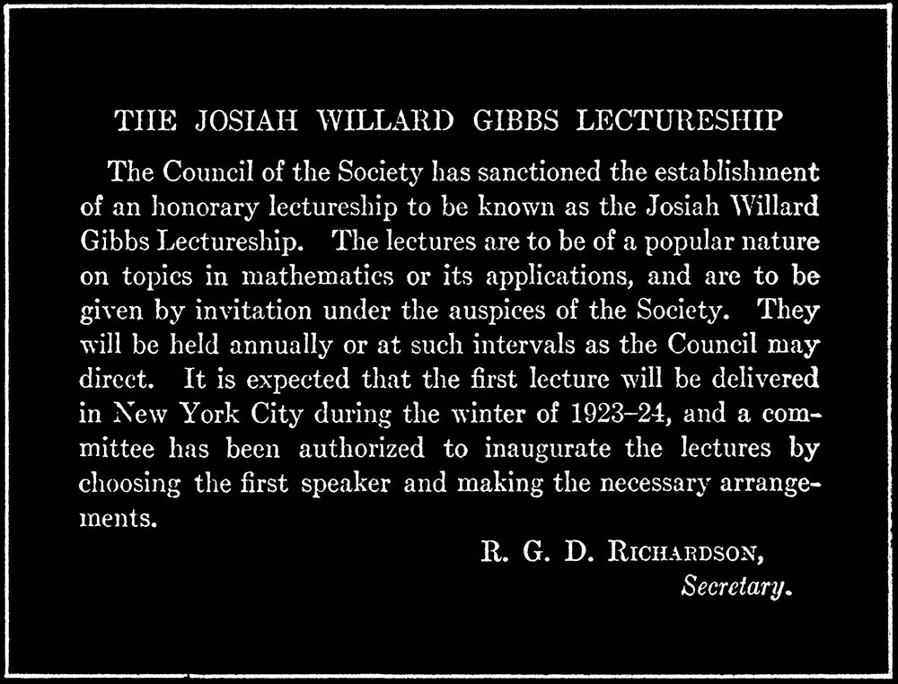
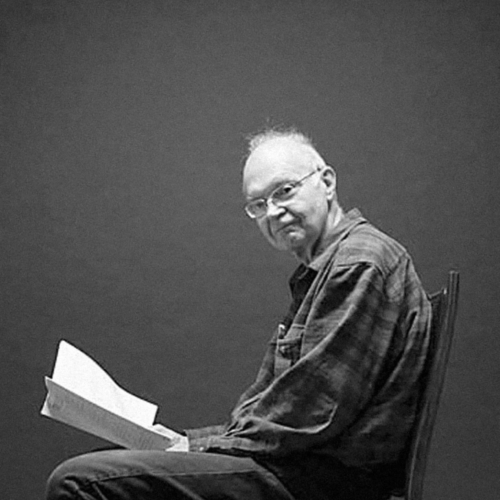
Computer scientist and Stanford professor emeritus Donald Knuth’s early digital typesetting experiments had a big impact on how we set type today. He also suggested a typographic path not taken. This was how he began his Josiah Willard Gibbs lecture at the American Mathematical Society on July 4, 1978:
I will be speaking today about work-in-progress instead of completed research. This was not my original intention when I chose the subject of this lecture, but the fact is I couldn’t get my computer programs working in time. Fortunately, it is just as well that I don’t have a finished product to describe to you today because research in mathematics is generally much more interesting while you’re doing it then after it’s all done.
It’s a prestigious lecture awarded annually for individual contributions to applied mathematics and when Knuth faced the room of mathematicians assembled in Providence, Rhode Island, he proceeded to talk not about math, but instead about typography. He began by showing slides, one after the other, pages from Bulletin of the American Mathematical Society illustrating how its composition and typography has changed over the last 100 years. For example, he showed this page from 1922 and pointed to its sharp modern serif type.

These were typographic fine points likely lost on his audience. But he had a reason, or an agenda anyway. He was showing these because he was upset by how the journal looked now. The Bulletin had switched to phototypesetting and Knuth found the result so (typographically) poor, that he refused to publish his work in it.

Knuth talked not just about the typography in the journals, but also about a project he was working on to improve the prospects for digital typesetting. The “work-in-progress” he alluded to at the start of the talk, a new digital typesetting system, continued for the next 10 years. He discussed a few specific problems along the way in precisely describing subtle curves in the shapes of letters.
November 27, 2023
Mathematical Typography
Readings
Mathematical Typography
Readings
A-Note-on-the-Type.pdf (Dexter Sinister)
Assignment