At the American Institute of Architects national conference in 1973, Sheila Levrant de Bretteville described her search:
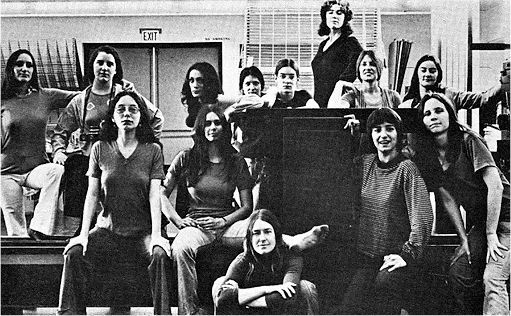
These were students in The Women’s Design Program at the California Institute of the Arts, a newly established program in a newly established art school which de Bretteville was instrumental in founding. The Women’s Design Program was meant to foster collective investigation between students and faculty. It was non-hierarchical, exploratory, participatory — a clearly distinct approach from the top-down knowledge transfer of more conventional teaching. And one that is neatly inline with de Bretteville’s call above. The two-sided model she suggests is powerful, recognizing that *how* design work gets done can carry as much meaning as *what* results.
On returning from Italy in 1969 after working with Olivetti, de Bretteville moved to Los Angeles to be involved in the formation of the new school. She was hired to design the printed materials to attract a new kind of student. She also edited an issue of Arts in Society. The issue has a wonderfully predictive subtitle, setting the stage for what’s to come. Again, the community, the setup, is as important as whatever teaching might happen there.
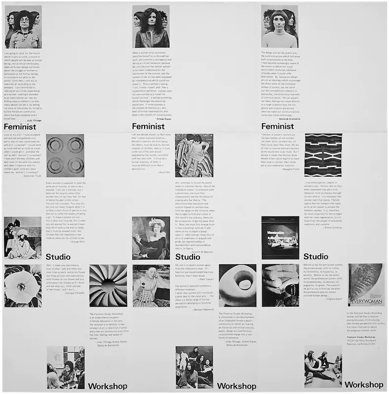
Not long after beginning to teach at CalArts, de Bretteville joined with fellow art faculty Judy Chicago and Arlene Raven to form a new offshoot, independent program they named the Feminist Studio Workshop. The initial brochure usefully repeats a picture of the three founding women together, each taking turns facing the camera. Here is the one with Sheila facing forward [↓].

The Feminist Studio Workshop met first in de Bretteville’s home, and soon was housed in the the Woman's Building, a collective site west of downtown Los Angeles. Here is a “video letter” from a participant who describes the setup. Again, the way the work gets done is what matters.
Continues in class . . .
I have begun to try to find an answer for myself as a woman designer. Designers must work in two ways. We must create visual and physical designs which project social forms but simultaneously we must create the social forms which will demand new visual and physical manifestations.A printed version of her talk soon appeared under the title A Reexamination of Some Aspects of the Design Arts from the Perspective of a Woman Designer, published together with her students’ [↓] work in British design journal Icographic 6.
These were students in The Women’s Design Program at the California Institute of the Arts, a newly established program in a newly established art school which de Bretteville was instrumental in founding. The Women’s Design Program was meant to foster collective investigation between students and faculty. It was non-hierarchical, exploratory, participatory — a clearly distinct approach from the top-down knowledge transfer of more conventional teaching. And one that is neatly inline with de Bretteville’s call above. The two-sided model she suggests is powerful, recognizing that *how* design work gets done can carry as much meaning as *what* results.
On returning from Italy in 1969 after working with Olivetti, de Bretteville moved to Los Angeles to be involved in the formation of the new school. She was hired to design the printed materials to attract a new kind of student. She also edited an issue of Arts in Society. The issue has a wonderfully predictive subtitle, setting the stage for what’s to come. Again, the community, the setup, is as important as whatever teaching might happen there.
Not long after beginning to teach at CalArts, de Bretteville joined with fellow art faculty Judy Chicago and Arlene Raven to form a new offshoot, independent program they named the Feminist Studio Workshop. The initial brochure usefully repeats a picture of the three founding women together, each taking turns facing the camera. Here is the one with Sheila facing forward [↓].
The Feminist Studio Workshop met first in de Bretteville’s home, and soon was housed in the the Woman's Building, a collective site west of downtown Los Angeles. Here is a “video letter” from a participant who describes the setup. Again, the way the work gets done is what matters.
Continues in class . . .
November 11, 2024
A reexamination of some aspects
Readings
A Reexamination of Some Aspects of the Design Arts from the Perspective of a Woman Designer (Sheila Levrant de Bretteville)
Resources
Clearing the Haze: Prologue to Postmodern Graphic Design Education through Sheila de Bretteville
Being Otherwise — A conversation with Sheila Levrant de Bretteville on feminism, public art, education, and the gentle art of activism
Design Insights Lecture 2018, Walker Art Center
Icographic 6
On Sheila Levrant de Bretteville (Meg Miller)
Assignment
A-Rexamination-of-Some-Aspects.txt