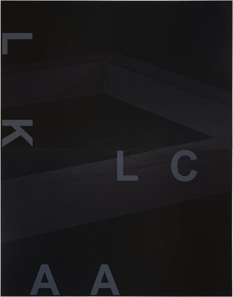
Adam,* why do you choose Arial for the letters that sit across the surface of your paintings and objects? Why not Helvetica, the industrial sans serif typeface with letterforms that are both more formally resolved and in tune with the art histories to which your work connects?
In the series “Black Dada” (2008–09), you use photocopied enlargements of Sol LeWitt’s Incomplete Cubes (1974) layered with large capital letters to spell part of your work’s title. These paintings (well, silkscreens on canvas) attempt to connect to more than one era—the 1910s of the Dada movement, through your use of its broken language strategies and your title, and also the 1970s of the unfinished Conceptual art project, through images of the Incomplete Cubes.

In “System of Display” (2008–09), a series of wall-mounted mirrored black boxes, you layer found images, photocopied and enlarged, with text fragments screened on the glass surfaces. This comprehensive series is mounted as a relentless row of ten or more boxes on the gallery wall, each containing a different found image and text fragment. Clues to the meaning of the series are located in the individual works’ titles. For example, EE (Generates / Giulio Paolini, Young man looking at Lorenzo Lotto, 1967) (2008–2009) reaches to both the late 1960s of Italian Arte Povera conceptualist Giulio Paolini and the late fifteenth-century Renaissance-to-Mannerist painter Lorenzo Lotto.
Poet Jena Osman recently described your layered text-image compositions as copies that “lovingly degrade the past in order to create a new lineage that can move into the future.” In an interview with curator Krist Gruijthuijsen you said, “My work cancels out any kind of autonomy . . . it much more concerns the connections between things that are often made disparate or have been disconnected.” It seems pretty clear that you’re trying to recompile history by creating a set of signs whose place in time is complicated. So, Adam, why Arial?
. . .
Helvetica itself was nothing new anyway—it was a redrawing of Neue Haas Grotesque in the 1950s, which itself was based on Akzidenz Grotesque from the early twentieth century, in turn derived from the Standard Grotesque of the late 1800s. Arial could easily fit into this lineage. As described in the Readme file that ships with v3.0 of the font software, “Arial contains more humanist characteristics than many of its predecessors and as such [sic] more in tune with the mood of the last decades of the twentieth century.”

In the series “Black Dada” (2008–09), you use photocopied enlargements of Sol LeWitt’s Incomplete Cubes (1974) layered with large capital letters to spell part of your work’s title. These paintings (well, silkscreens on canvas) attempt to connect to more than one era—the 1910s of the Dada movement, through your use of its broken language strategies and your title, and also the 1970s of the unfinished Conceptual art project, through images of the Incomplete Cubes.

In “System of Display” (2008–09), a series of wall-mounted mirrored black boxes, you layer found images, photocopied and enlarged, with text fragments screened on the glass surfaces. This comprehensive series is mounted as a relentless row of ten or more boxes on the gallery wall, each containing a different found image and text fragment. Clues to the meaning of the series are located in the individual works’ titles. For example, EE (Generates / Giulio Paolini, Young man looking at Lorenzo Lotto, 1967) (2008–2009) reaches to both the late 1960s of Italian Arte Povera conceptualist Giulio Paolini and the late fifteenth-century Renaissance-to-Mannerist painter Lorenzo Lotto.
Poet Jena Osman recently described your layered text-image compositions as copies that “lovingly degrade the past in order to create a new lineage that can move into the future.” In an interview with curator Krist Gruijthuijsen you said, “My work cancels out any kind of autonomy . . . it much more concerns the connections between things that are often made disparate or have been disconnected.” It seems pretty clear that you’re trying to recompile history by creating a set of signs whose place in time is complicated. So, Adam, why Arial?
. . .
Helvetica itself was nothing new anyway—it was a redrawing of Neue Haas Grotesque in the 1950s, which itself was based on Akzidenz Grotesque from the early twentieth century, in turn derived from the Standard Grotesque of the late 1800s. Arial could easily fit into this lineage. As described in the Readme file that ships with v3.0 of the font software, “Arial contains more humanist characteristics than many of its predecessors and as such [sic] more in tune with the mood of the last decades of the twentieth century.”

* ”Adam” is contemporary artist Adam Pendleton, whose work uses typography and recycled writing extensively.Continues in class . . .
November 18, 2024
Adam, Why Arial?
Readings
Adam-Why-Arial.pdf (David Reinfurt)
Resources
What is American about Black Dada
The Studio of Adam Pendleton
Who is Queen?
Adam-why-arial.txt
Adam, Why Arial?
Readings
Adam-Why-Arial.pdf (David Reinfurt)
Resources
What is American about Black Dada
The Studio of Adam Pendleton
Who is Queen?
Adam-why-arial.txt