Princeton University
Visual Arts Program
VIS 215, T-y-p-o-g-r-a-p-h-y
Mondays, 1:30–4:20 pm
Fall 2025
This studio course introduces students to graphic design with a particular emphasis on typography. Students learn typographic history through lectures that highlight major shifts in print technologies. Class readings provide the raw material for a sequence of hands-on typesetting exercises which punctuate the class weekly. Metal letterpess typesetting, photo-typesetting, and digital typesetting will be covered through online demonstration sessions. This semester online, the class will also further explore the typographic future by engaging and designing novel electronic text entry interfaces and decoding a fictional alien typography.
All work must be completed eloquently, precisely, and thoughtfully. Final grades are based on Exercises (20%), Assignments (60%), and Class preparation / participation (20%). Each unexcused absence lowers the final grade by 5 points.
Print syllabus / Download readings
September 8, 2025
Arrival
Resources
What an Alien Writing System Can Teach Us about Human Language
Prediction-Tenselesness-and-What-It-Takes-to-be-a-Verb.pdf (Jessica Coon)
Arrival Live Coding on Github
Exercise
Glyph-for-Human.jpg
Field Trip
New York Art Book Fair
Arrival
Resources
What an Alien Writing System Can Teach Us about Human Language
Prediction-Tenselesness-and-What-It-Takes-to-be-a-Verb.pdf (Jessica Coon)
Arrival Live Coding on Github
Exercise
Glyph-for-Human.jpg
Field Trip
New York Art Book Fair
Let's start in the middle:
She also records their extraterrestrial voices, and deduces a way to proceed based on a correlation between the two.
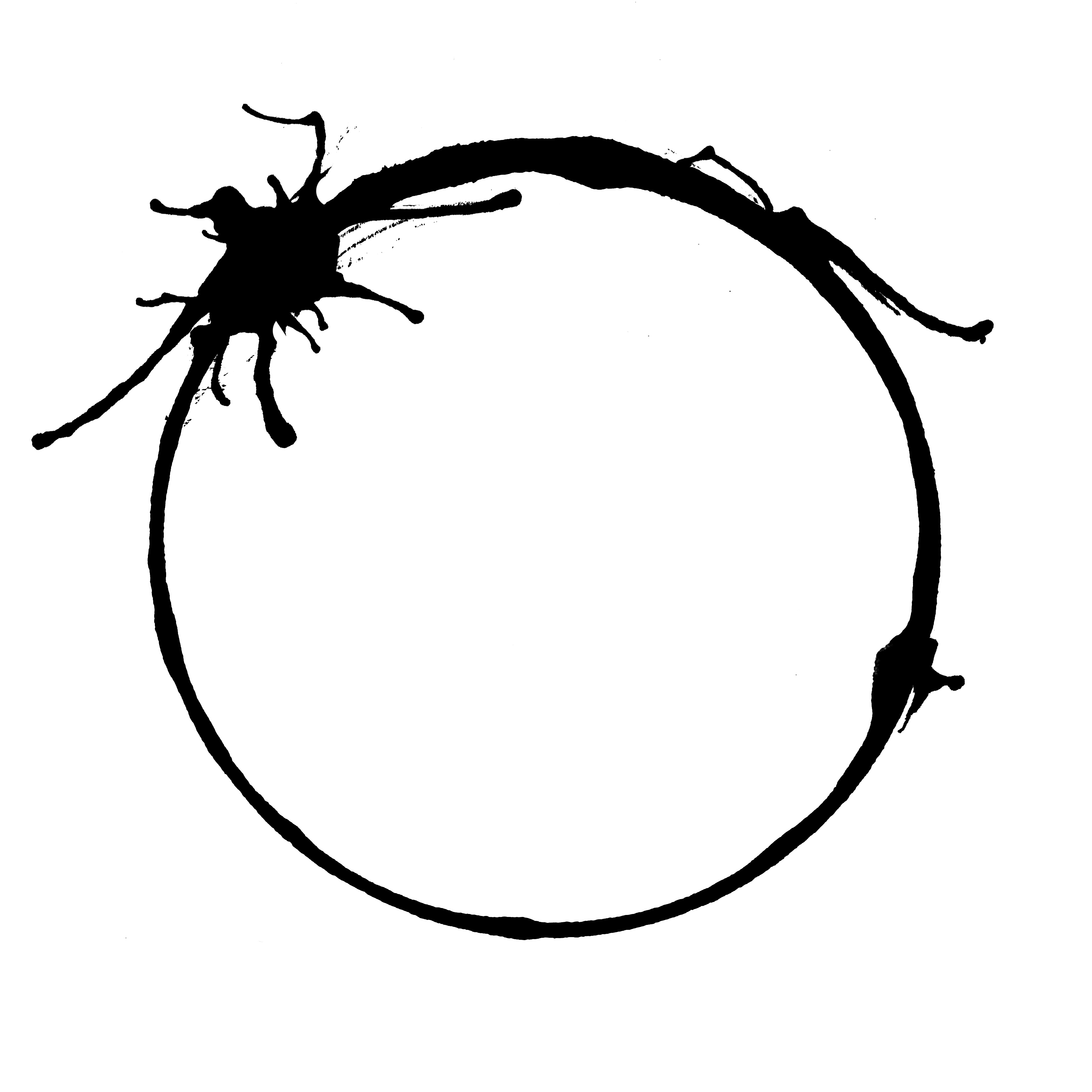
The glyphs above were never written, but rather they’ve been inferred by a computer program trained to the task. This is also typography. It is also almost science-fiction, though of course its already ready now. Some of you may even know how to do it. You can read a bit more about this project here. And meanwhile, back to the story.
"I have an idea as to how we can make faster progress," I said. "But you'll have to approve the use of more equipment."
"What more do you need?"
"A digital camera, and a big video screen." I showed him a drawing of the setup I imagined. "I want to try conducting the discovery procedure using writing; I'd display words on the screen, and use the camera to record the words they write. I'm hoping the heptapods will do the same."Digital camera and a big video screen — reminds me of Zoom times and makes me happy we don’t meet each other that way. It’s actually science fiction: Story of Your Life by Ted Chiang. It’s brief and complicated. It’s visual. It’s even typographical. You might already know the plot from its film adaptation in 2016 starring Amy Adams and Forest Whitaker, Arrival. Meanwhile, our story continues.
Weber looked at the drawing dubiously. "What would be the advantage of that?"
"So far I've been proceeding the way I would with speakers of an unwritten language. Then it occurred to me that the heptapods must have writing, too."
"So?"
"If the heptapods have a mechanical way of producing writing, then their writing ought to be very regular, very consistent. That would make it easier for us to identify graphemes instead of phonemes. It's like picking out the letters in a printed sentence instead of trying to hear them when the sentence is spoken aloud."
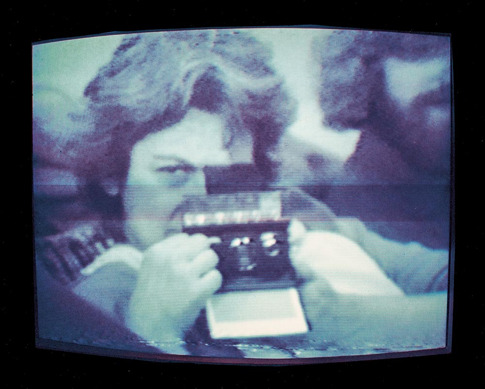
"I take your point," he admitted. "And how would you respond to them? Show them the words they displayed to you?"“Graphemes”? “Phonemes”? Sounds like typography to me. And in fact it is—the story proceeds as a kind of typographic detective story, but instead of whodunnit, this one’s a howdtheydoit. We find out quickly enough that the Heptapods do indeed have a writing system and they also have a spoken language. Here’s a scene from early in the film version when Dr. Louise Banks (Amy Adams) first witnesses the strange handwriting:
She also records their extraterrestrial voices, and deduces a way to proceed based on a correlation between the two.
"Basically. And if they put spaces between words, any sentences we write would be a lot more intelligible than any spoken sentence we might splice together from recordings."
He leaned back in his chair. "You know we want to show as little of our technology as possible."Surely.
"I understand, but we're using machines as intermediaries already. If we can get them to use writing, I believe progress will go much faster than if we're restricted to the sound spectrographs."
The colonel turned to Gary. "Your opinion?"
"It sounds like a good idea to me. I'm curious whether the heptapods might have difficulty reading our monitors. Their looking glasses are based on a completely different technology than our video screens. As far as we can tell, they don't use pixels or scan lines, and they don't refresh on a frame-by-frame basis."This is an imaginary, or anyway, *conjured* set of digits produced by harnessing a neural network to a large database of handwritten numbers.
The glyphs above were never written, but rather they’ve been inferred by a computer program trained to the task. This is also typography. It is also almost science-fiction, though of course its already ready now. Some of you may even know how to do it. You can read a bit more about this project here. And meanwhile, back to the story.
"You think the scan lines on our video screens might render them unreadable to the heptapods?"
"It's possible," said Gary. "We'll just have to try it and see."Continues in class . . .
September 15, 2025
Introduction
Reading
A Man of Letters (Oliver Sacks)
Resources
Bi Sheng
Albrecht Dürer
Mark Changizi blog
Type Rubric
Music for to Set Type By
More Music to Set Type By
Type Shop Technician
Glen Koslowsky
Introduction
Reading
A Man of Letters (Oliver Sacks)
Resources
Bi Sheng
Albrecht Dürer
Mark Changizi blog
Type Rubric
Music for to Set Type By
More Music to Set Type By
Type Shop Technician
Glen Koslowsky
Typography has something of a split personality—it’s both the technical act of writing words into the world by giving them form, and it’s also a way of understanding the world through the forms of its writing. Designer Paul Elliman describes this two-way street concisely:
The idea is to learn something about typography and therefore graphic design by practicing it, and along the way to understand how typographic techniques have changed over time in order to develop a nuanced facility in using the current digital tools.
We’re going to start with Albrecht Dürer: painter, engraver, mathematician, goldsmith. He lived in Nuremberg and was a leading protagonist of the Northern Renaissance. I would also certainly call him a designer. This is Melancholia I, a print from 1514.
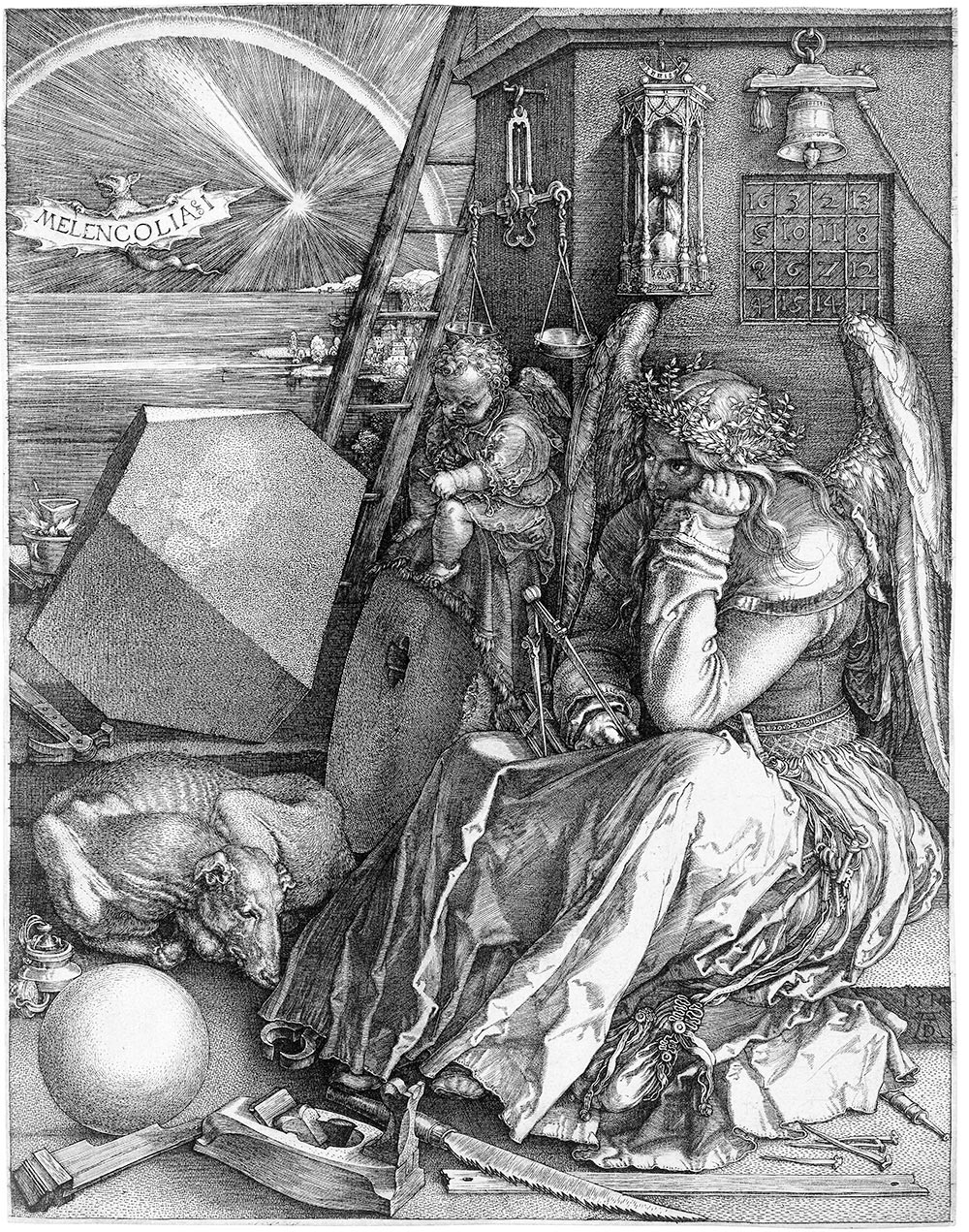
Movable-type printing had been introduced in Germany only 75 years earlier. It had already existed in China for 400 years, invented by Bi Sheng in the Northern Song Dynasty around 1040 A.D. In Dürer's Europe, the production of typeset pages in multiple copies was still new, but as an engraver of metal printing plates Dürer was familiar with the process. This image has been reproduced many times and discussed, dissected, and deconstructed. What I like about it is something simple—it depicts a figure sitting still, kind of stymied.
Continues in class ...
Writing gives the impression of things. Conversely, things can give the impression of writing.I’d suggest this reading and writing at the same time, or typography, is the root level skill of graphic design, and I’d like to talk about typography as something that joins reading and writing. Three modes of production will be presented in chronological order as a compressed reenactment of 500 years of typographic tradition, each one revolving around a particular technology: metal typesetting, phototypesetting, and digital typesetting.
The idea is to learn something about typography and therefore graphic design by practicing it, and along the way to understand how typographic techniques have changed over time in order to develop a nuanced facility in using the current digital tools.
We’re going to start with Albrecht Dürer: painter, engraver, mathematician, goldsmith. He lived in Nuremberg and was a leading protagonist of the Northern Renaissance. I would also certainly call him a designer. This is Melancholia I, a print from 1514.
Movable-type printing had been introduced in Germany only 75 years earlier. It had already existed in China for 400 years, invented by Bi Sheng in the Northern Song Dynasty around 1040 A.D. In Dürer's Europe, the production of typeset pages in multiple copies was still new, but as an engraver of metal printing plates Dürer was familiar with the process. This image has been reproduced many times and discussed, dissected, and deconstructed. What I like about it is something simple—it depicts a figure sitting still, kind of stymied.
Continues in class ...
September 22, 2025
A Pair of Postmasters
Readings
Apology-for-Printers.pdf (Benjamin Franklin)
The-Crystal-Goblet.pdf (Beatrice Warde)
Resources
Mechanick Exercises
Several Fonts of Type
Beatrice Warde on Type Radio
Type Shop Technician
Glen Koslowsky
A Pair of Postmasters
Readings
Apology-for-Printers.pdf (Benjamin Franklin)
The-Crystal-Goblet.pdf (Beatrice Warde)
Resources
Mechanick Exercises
Several Fonts of Type
Beatrice Warde on Type Radio
Type Shop Technician
Glen Koslowsky
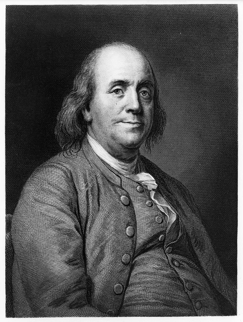
As it turns out, the day I wrote this was Benjamin Franklin’s 300th birthday. Writer, typographer, printer, publisher, politician, inventor, statesman, gentleman scientist, linguist, librarian, and the first Postmaster General of the United States, Franklin was the consummate networker. Distributing his ideas far and wide through a dizzying range of practices, he established a network of printing franchises by sending former apprentices to set up shop in new towns and collecting dues. He traveled extensively to London and to the courts of France, fostering alliances that helped form a nation. He wrote incisive arguments and entertainments under a constellation of pseudonyms including the Casuist, Silence Dogood, Busy-Body, Poor Richard, and J. T. to suit the purpose at hand. He advocated for a paper currency to facilitate the liberal distribution of goods and services while he was also a printer and so stood to make money by printing the paper currency which he lobbied for! He was often working both sides of the equation and I think this compromised quality is what I like about this familiar engraving—his almost-smirk.
He published a weekly newspaper, an occasional magazine, and the annual Poor Richard’s Almanack. Along the way, Franklin pursued his polymathic interests, inventing (a partial list): the medical catheter, the armonica (a musical instrument), a phonetic alphabet, the circulating stove, swim fins, binoculars, and the lightning rod. He founded the first public lending library, a volunteer fire department, the American Philosophical Society, a university, and was the first Postmaster General of the United States. He was a committed generalist.
. . .
Beatrice Warde also used her frontline position in typography as a gateway to injecting her voice into a wider conversation through her writing.
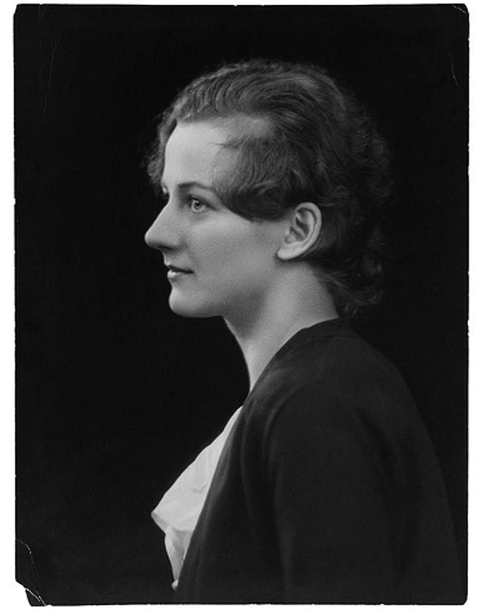
Warde was born in New York City in 1900. Her father was an experimental musician from Germany who developed a chromatic alphabet. Her mother was May Lamberton Becker, a columnist at the New York Herald Tribune at the turn of the 20th century. Beatrice was often involved in her mother’s work at the Herald Tribune, so she had an early appreciation for letters, for typography, for writing, and for editing.
After homeschooling until age twelve, Warde was sent to Horace Mann School, a progressive academy in New York City. She whizzed through her classes in Greek and Latin, everyday skills, and public service. She graduated in two years. From Horace Mann she went to Barnard College, which was a part of Columbia University. There she studied English, French, Latin, writing, and philosophy, among other subjects. Warde was something of a prodigy.
Continues in class . . .
He published a weekly newspaper, an occasional magazine, and the annual Poor Richard’s Almanack. Along the way, Franklin pursued his polymathic interests, inventing (a partial list): the medical catheter, the armonica (a musical instrument), a phonetic alphabet, the circulating stove, swim fins, binoculars, and the lightning rod. He founded the first public lending library, a volunteer fire department, the American Philosophical Society, a university, and was the first Postmaster General of the United States. He was a committed generalist.
. . .
Beatrice Warde also used her frontline position in typography as a gateway to injecting her voice into a wider conversation through her writing.
Warde was born in New York City in 1900. Her father was an experimental musician from Germany who developed a chromatic alphabet. Her mother was May Lamberton Becker, a columnist at the New York Herald Tribune at the turn of the 20th century. Beatrice was often involved in her mother’s work at the Herald Tribune, so she had an early appreciation for letters, for typography, for writing, and for editing.
After homeschooling until age twelve, Warde was sent to Horace Mann School, a progressive academy in New York City. She whizzed through her classes in Greek and Latin, everyday skills, and public service. She graduated in two years. From Horace Mann she went to Barnard College, which was a part of Columbia University. There she studied English, French, Latin, writing, and philosophy, among other subjects. Warde was something of a prodigy.
Continues in class . . .
September 29, 2025
An unnecessary duplication of sense
Reading
Modern Typography (Robin Kinross)
Resources
Hyphen Press
Modern Typography via Éditions B42
Buttoned Down (Robin Kinross)
Type Shop Technician
Glen Koslowsky
An unnecessary duplication of sense
Reading
Modern Typography (Robin Kinross)
Resources
Hyphen Press
Modern Typography via Éditions B42
Buttoned Down (Robin Kinross)
Type Shop Technician
Glen Koslowsky
If the printing process was one of the main facilitators in the development of the modern world, then the phrase ‘modern typography’ may be an unnecessary duplication of sense. Is not all typography modern?And so begins the exceptionally cogent argument that design historian and publisher Robin Kinross offers in his foundational book Modern Typography. It’s a singular account of the rise of typography as a discipline. If you are interested to have a firm grounding in typographic history, this is absolutely the place to begin. I strongly suggest buying the book, putting it on your shelf, and looking forward to referring to it again and again.
My own copy shows that iI have returned again and again — it’s lousy with notes [↓].
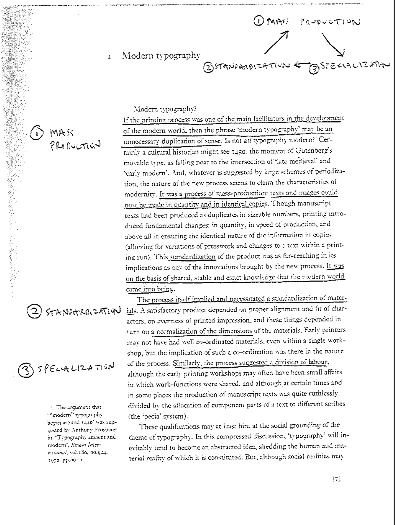
Top right of this page is one particularly important note, a kind of schematic diagram implied in the text. Kinross suggests that typography emerged as its own professional practice separate from printing, in part anyway, as a result of this self-propelling and self-reinforcing three-way cycle [↓].
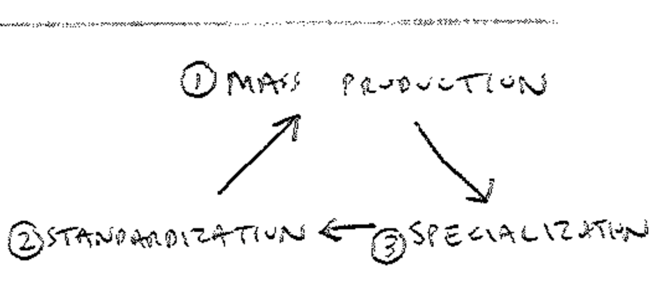
Emerging mass production required specialization to break up the task into more efficient units. Specialized workers could develop specific competencies which then fueled the speed of mass production. Specialization was then facilitated by standardization, of the materials and practice of printing (measurement systems, type height, naming protocols). Agreed standards allowed printers to work with common type foundries and presses which then accelerated the mass production process. (I really should have drawn the arrows going both directions as each part of the process reinforces the other ... oh well.)
I would like you to pay special attention to places in the chapters I have asked you to read where one of these three parts of the triangle above appear. Make mental notes and physical notes. We will look at this together in class next week.
October 6, 2025
The Elements of Typographic Style
Reading
Elements-of-Typographic-Style.pdf (Robert Bringhurst)
Resources
The Elements of Typographic Style on the Internet Archive
Type Shop Technician
Glen Koslowsky
Exercise
Rubbings
The Elements of Typographic Style
Reading
Elements-of-Typographic-Style.pdf (Robert Bringhurst)
Resources
The Elements of Typographic Style on the Internet Archive
Type Shop Technician
Glen Koslowsky
Exercise
Rubbings
Poet and typographer Robert Bringhurst begins:
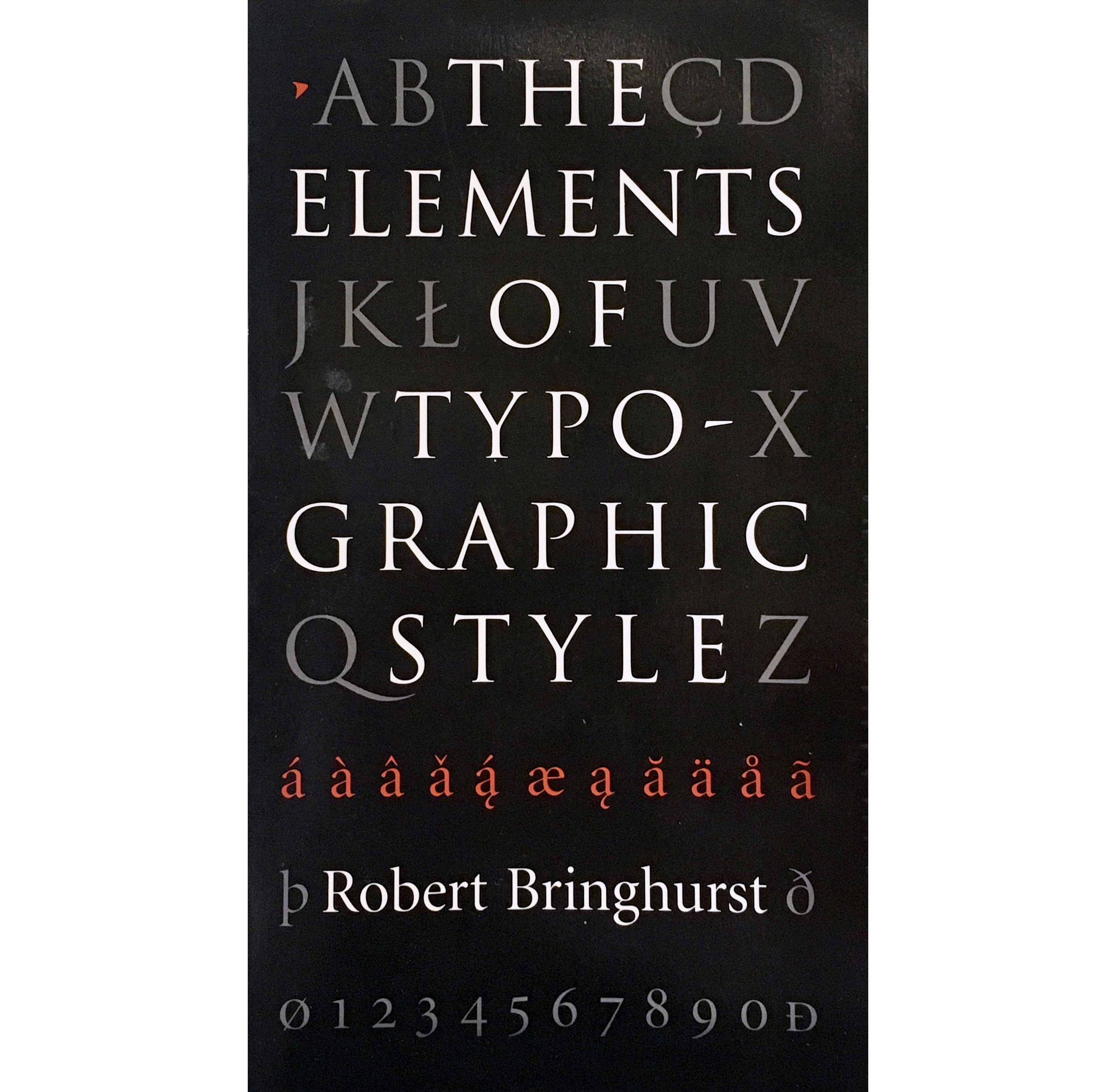
The book is meticulously organized with crisply numbered sections and subsections. Section 1.1, First Principles continues:
Like oratory, music, dance, calligraphy - like anything that lends its grace to language - typography is an art that can be deliberately misused. It is a craft by which the meanings of a text (or its absence of meaning) can be clarified and honored, or knowingly disguised.The Elements of Typographic Style is his book, first published in 1992 and updated regularly since. It is a foundational resource for learning how to work confidently and eloquently with letters.
The book is meticulously organized with crisply numbered sections and subsections. Section 1.1, First Principles continues:
In a world rife with unsolicited messages, typography must often draw attention to itself before it will be read. Yet in order to be read, it must relinquish the attention it has drawn. Typography with anything to say therefore aspires to a kind of statuesque transparency. Its other traditional goal is durability: not immunity to change, but a clear superiority to fashion. Typography at its best is a visual form of language linking timelessness and time.Naturally, given its subject matter, the book is also (and crisply) typographically organized. It provides extensive information on typographic nuts and bolts, but what I particularly appreciate is the context he provides for why all of this matters.
One of the principles of durable typography is always legibility; another is something more than legibility: some earned or unearned interest that gives its living energy to the page. It takes various forms and goes by various names, including serenity, liveliness, laughter, grace and joy. These principles apply, in different ways, to the typography of business cards, instruction sheets and postage stamps, as well as to editions of religious scriptures, literary classics and other books that aspire to join their ranks. Within limits, the same principles apply even to stock market reports, airline schedules, milk cartons, classified ads. But laughter, grace and joy, like legibility itself, all feed on meaning, which the writer, the words and the subject, not the typographer, must generally provide.Continues in class . . .
October 20, 2025
Farewell Etoin Shrdlu
Readings
Story-of-Your-Life.pdf (Ted Chiang)
Resources
Farewell Etaoin Shrdlu
NYT Obituary for Carl Schlesinger
Karel Martens, Unbound, Stedlijk Museum (Amsterdam)
Karel Martens, Unbound, Stedlijk Museum (Amsterdam) video
Karel Martens 30 km/h street painting
Karel Martens 30 km/h street painting (more)
Karel Martens 30 km/h street painting (interview)
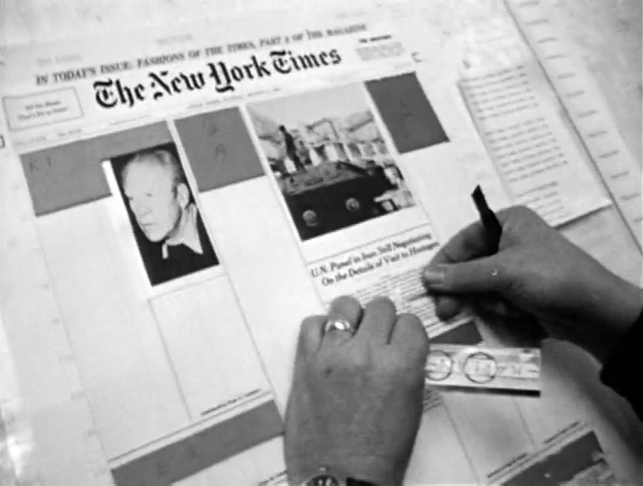
Phototypesetting was always a transitional technology between metal and digital typesetting. It evolved through several stages, none of which ever really stuck. Farewell, Etaoin Shrdlu, a film directed by David Loeb Weiss, captures one moment in this transition by chronicling the last day of metal typesetting at the New York Times on July 2, 1978. The Times was moving away from Linotype machines and on to the next level of typographic automation, where a new system used a hybrid of computerized storage and photographic reproduction techniques to set all the words in the daily newspaper.
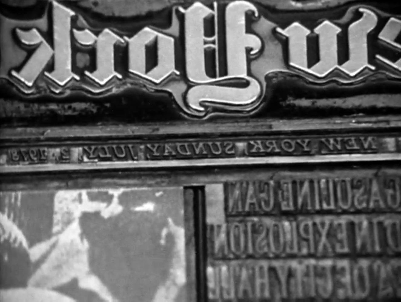
The film was shot entirely in the New York Times building in midtown Manhattan, where production was vertically integrated, in this case literally, as a series of stacked basements and sub-basements where typesetting, printing, bundling, and even distribution were handled.
Daily production started from the editorial staff on the top floor and proceeded from one level down to the next, ending with delivery trucks pulling up to a loading dock and carting away bound papers for distribution.
It’s useful to think about what these technical changes allowed for the distribution of news. What resulted from being able to set the paper so much more quickly? More editions per day? More money for reporting? Perhaps a rearrangement of physical space? Or more resources for long articles and also a broader range of quick-hit stories? Shifts in typographic technology inevitably provoke deep changes in what can be said, how it is printed, and what effects these printed words have in the world.
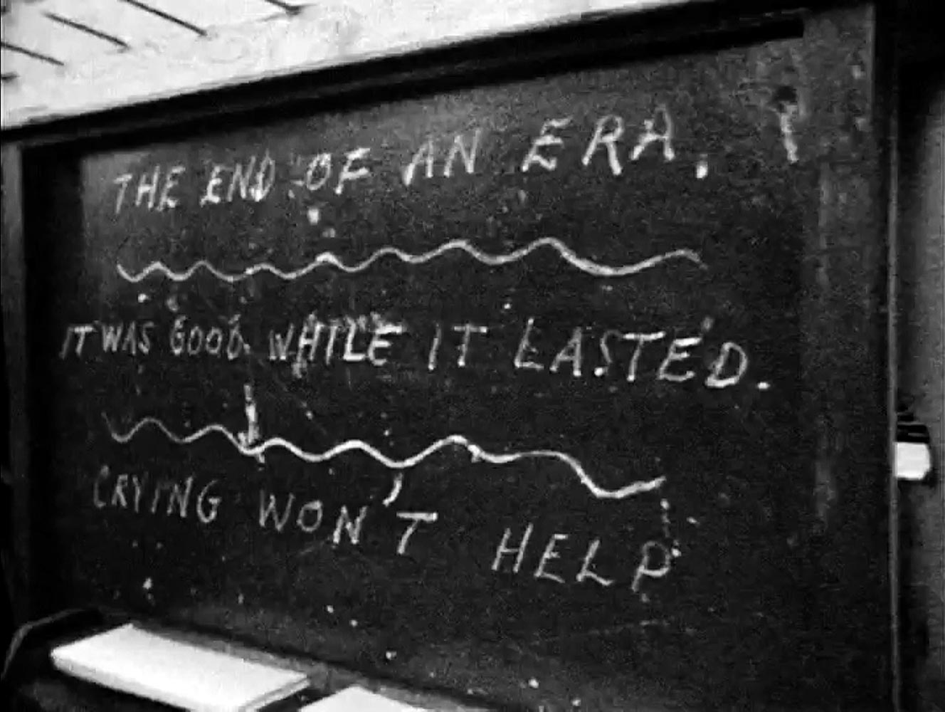
The film is approximately 30 minutes. It is narrated by veteran Linotype operator Carl Schlesinger.
Continues in class . . .
The film was shot entirely in the New York Times building in midtown Manhattan, where production was vertically integrated, in this case literally, as a series of stacked basements and sub-basements where typesetting, printing, bundling, and even distribution were handled.
Daily production started from the editorial staff on the top floor and proceeded from one level down to the next, ending with delivery trucks pulling up to a loading dock and carting away bound papers for distribution.
It’s useful to think about what these technical changes allowed for the distribution of news. What resulted from being able to set the paper so much more quickly? More editions per day? More money for reporting? Perhaps a rearrangement of physical space? Or more resources for long articles and also a broader range of quick-hit stories? Shifts in typographic technology inevitably provoke deep changes in what can be said, how it is printed, and what effects these printed words have in the world.
The film is approximately 30 minutes. It is narrated by veteran Linotype operator Carl Schlesinger.
Continues in class . . .
October 27, 2025
Raytracing, or Alphabets of Light
Reading
The-New-Typography.pdf (László Moholy-Nagy)
Resources
Anna Atkins
Raytracing, or Alphabets of Light
Reading
The-New-Typography.pdf (László Moholy-Nagy)
Resources
Anna Atkins
László Moholy-Nagy was a Hungarian artist, designer, writer, and teacher. He worked in Germany, England, and the United States. This portrait from 1926 maybe reveals something of Moholy’s disposition. He’s wearing a workman’s jumpsuit over a dress shirt and tie, looking like a hybrid worker-technocrat. He oriented himself more as a designer than an artist, although the distinction was fuzzy. He looks rather austere, but wasn’t—his friends called him “Holy Mahogany.”
Moholy was interested in photography. It was relatively new at the time and he recognized it as a contemporary way to make images. His photographic experiments often pushed at the edges of the medium. He exaggerated perspective and used unexpected vantage points to abstract the subjects he shot. He cut up prints and assembled collages. He gathered images into composites. And he made photograms. Here are two:
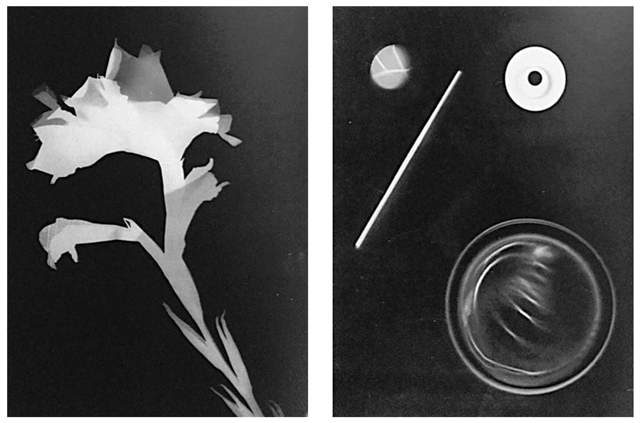
Photograms are images made directly from, or, in fact, by, an object. The object is placed directly on photo-sensitive paper and then the paper is exposed to light. The result is a contact print, a kind of light tracing. You might think of a photogram as seeing through an object to its essence. There’s a one-to-one directness to the print, where the object is reproduced at the same scale as the image made of it. The process is immediate and the result has an equally urgent quality. It is not dissimilar from printing.
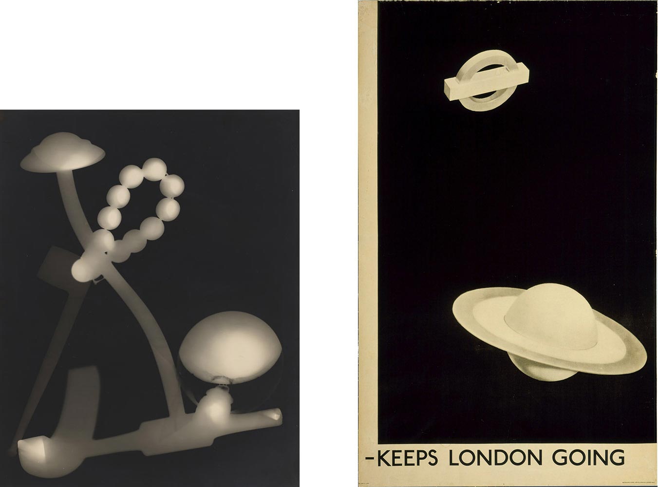
American artist Man Ray developed the technique around the same time and he called them “rayographs.” Man Ray was born as Emmanuel Radnitzky, a Russian Jewish boy from South Philadelphia. He found his way to Paris, and made art. Lots of it. So, for example this is one of his photograms on the left. But he made many things other than rayographs, including poetry and even typography. I love this poster on the right which Man Ray designed for The London Underground in 1932, which seems to pick up a sentence mid-thought. It’s not a photogram, but who cares, it has something of that quality.
And even a good century before, British botanist Anna Atkins produced an extraordinary collection of photograms made with sunlight as cyanotypes of the different types of algae. These pictures were meant as an inventory of algae varieties found in England where they accompanied a text in what has been claimed as the first photographic book, Photographs of British Algae: Cyanotype Impressions (1843).
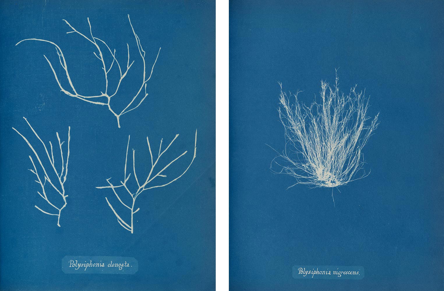
Stunning.
Continues in class . . .
Moholy was interested in photography. It was relatively new at the time and he recognized it as a contemporary way to make images. His photographic experiments often pushed at the edges of the medium. He exaggerated perspective and used unexpected vantage points to abstract the subjects he shot. He cut up prints and assembled collages. He gathered images into composites. And he made photograms. Here are two:
Photograms are images made directly from, or, in fact, by, an object. The object is placed directly on photo-sensitive paper and then the paper is exposed to light. The result is a contact print, a kind of light tracing. You might think of a photogram as seeing through an object to its essence. There’s a one-to-one directness to the print, where the object is reproduced at the same scale as the image made of it. The process is immediate and the result has an equally urgent quality. It is not dissimilar from printing.
American artist Man Ray developed the technique around the same time and he called them “rayographs.” Man Ray was born as Emmanuel Radnitzky, a Russian Jewish boy from South Philadelphia. He found his way to Paris, and made art. Lots of it. So, for example this is one of his photograms on the left. But he made many things other than rayographs, including poetry and even typography. I love this poster on the right which Man Ray designed for The London Underground in 1932, which seems to pick up a sentence mid-thought. It’s not a photogram, but who cares, it has something of that quality.
And even a good century before, British botanist Anna Atkins produced an extraordinary collection of photograms made with sunlight as cyanotypes of the different types of algae. These pictures were meant as an inventory of algae varieties found in England where they accompanied a text in what has been claimed as the first photographic book, Photographs of British Algae: Cyanotype Impressions (1843).
Stunning.
Continues in class . . .
November 3, 2025
Pictures of the sky and other collections
Resources
On Language and Time (Nazlı Ercan)
“All at once” (Bryce Wilner)
Visitors
Nazlı Ercan
Bryce Wilner
Matt Wolff
Pictures of the sky and other collections
Resources
On Language and Time (Nazlı Ercan)
“All at once” (Bryce Wilner)
Visitors
Nazlı Ercan
Bryce Wilner
Matt Wolff
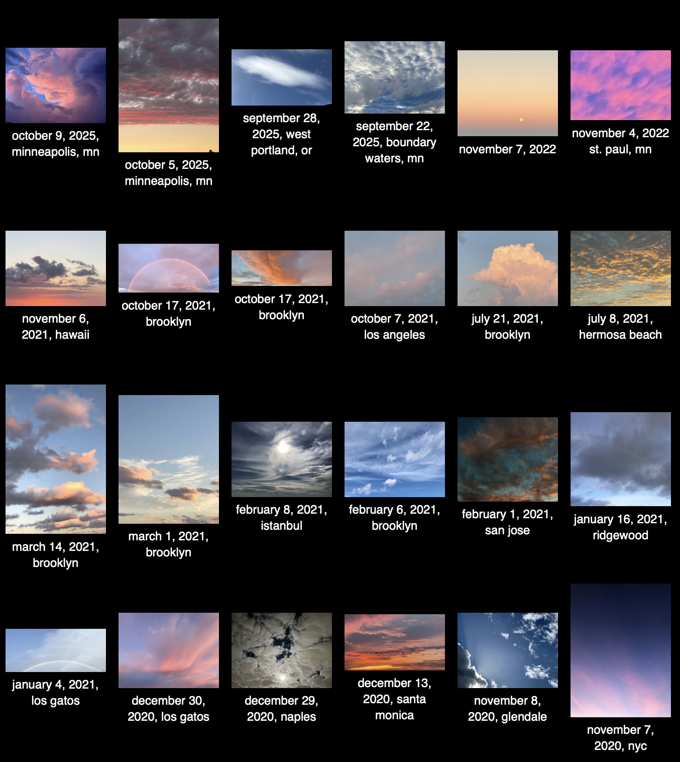
These are some pictures of the sky, taken by Nazlı Ercan over the last (approximately) 10 years [↓]:
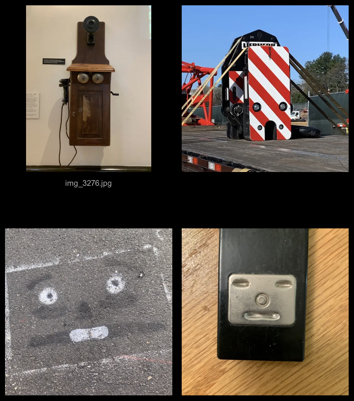
And here are a few found faces, collected in one of Nazlı's (many) public are.na channels [↓]:
These are something like inside-out-museums — rather than static artworks sourced, removed, and collected in an institution, these are works found *in* and remaining *of* the world. This makes a bit of sense as Nazlı studied Art History at Princeton and has since worked with and for a number of prominent museums. She has worked independently and collaboratively. She is currently Senior Designer at the Walker Art Center. Here's another collection.
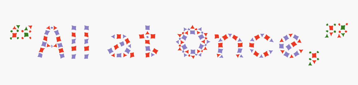
Nazlı will share some of her design work in class. She is joined by two other designers cut from similar cloth: Bryce Wilner and Matt Wolff. Bryce is an independent designer in New York whose work spans books, fonts, video, writing, teaching, and websites. He is also a publisher of extraordinary electronic projects through https://screen-door.net. You can read a bit about Bryce here from a previous Princeton class visit. Anyway, here is one of Bryce's fonts used to set a small fragment of his writing [↓] which I like very much:
Many of the websites are designed and programmed together with Matt Wolff. Matt is a designer and a developer and a teacher and well, here are some of his collections.
Continues in class . . .
And here are a few found faces, collected in one of Nazlı's (many) public are.na channels [↓]:
These are something like inside-out-museums — rather than static artworks sourced, removed, and collected in an institution, these are works found *in* and remaining *of* the world. This makes a bit of sense as Nazlı studied Art History at Princeton and has since worked with and for a number of prominent museums. She has worked independently and collaboratively. She is currently Senior Designer at the Walker Art Center. Here's another collection.
Nazlı will share some of her design work in class. She is joined by two other designers cut from similar cloth: Bryce Wilner and Matt Wolff. Bryce is an independent designer in New York whose work spans books, fonts, video, writing, teaching, and websites. He is also a publisher of extraordinary electronic projects through https://screen-door.net. You can read a bit about Bryce here from a previous Princeton class visit. Anyway, here is one of Bryce's fonts used to set a small fragment of his writing [↓] which I like very much:
Many of the websites are designed and programmed together with Matt Wolff. Matt is a designer and a developer and a teacher and well, here are some of his collections.
Continues in class . . .
November 10, 2025
This stands as a sketch for the future.
Readings
Visible-Wisdom.pdf (Janet Abrams)
The New Graphic Languages.pdf (Muriel Cooper)
Resources
Muriel Cooper (MIT Press)
Information Landscapes
The New Graphic Languages.txt
Computers-and-Design.pdf
Visitors
Gaile Pranckunaite
This stands as a sketch for the future.
Readings
Visible-Wisdom.pdf (Janet Abrams)
The New Graphic Languages.pdf (Muriel Cooper)
Resources
Muriel Cooper (MIT Press)
Information Landscapes
The New Graphic Languages.txt
Computers-and-Design.pdf
Visitors
Gaile Pranckunaite
What follows is a work in progress, the product of one year at MIT’s Center for Advanced Visual Studies tracing the legacy of graphic designer Muriel Cooper. It’s organized as a guided tour of various sites on the campus of MIT, attempting to track 40 years of Cooper’s work across different departments within the university.
Muriel Cooper always sought more responsive systems of design and production, emphasizing quicker feedback loops between thinking and making, often blurring the distinction between the two. OK, let’s go ahead and get started.
The Center for Advanced Visual studies was set up in 1967 by György Kepes as a fellowship program for artists. Initiated with considerable institutional and financial support, the Center produced artworks, exhibitions, and public programs that were often accompanied by a poster or publication. These posters provide an immediate, condensed, and visually legible accidental archive of its almost four-decade history.
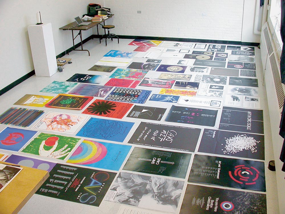
While working my way through the contents of the closet, I was struck immediately by the surface qualities of this extraordinary set of posters. It was not simply the graphic design nor the typography that caught me—rather it was their mode of production. The design of the posters changed sporadically as new designers or administrators appeared, but what remains the same is the way each self-consciously incorporates its production method into the design.
Continues in class . . .
Muriel Cooper always sought more responsive systems of design and production, emphasizing quicker feedback loops between thinking and making, often blurring the distinction between the two. OK, let’s go ahead and get started.
1. An accidental archive at the Center for Advanced Visual StudiesWe begin in a locked closet housing a collection of posters, documents, videotapes, and related printed matter which forms a de facto archive of the Center for Advanced Visual Studies. Embarking on a client-design relationship with the Center, I arrived in Cambridge to spend a few days going through the archive and examining its contents.
The Center for Advanced Visual studies was set up in 1967 by György Kepes as a fellowship program for artists. Initiated with considerable institutional and financial support, the Center produced artworks, exhibitions, and public programs that were often accompanied by a poster or publication. These posters provide an immediate, condensed, and visually legible accidental archive of its almost four-decade history.
While working my way through the contents of the closet, I was struck immediately by the surface qualities of this extraordinary set of posters. It was not simply the graphic design nor the typography that caught me—rather it was their mode of production. The design of the posters changed sporadically as new designers or administrators appeared, but what remains the same is the way each self-consciously incorporates its production method into the design.
Continues in class . . .
November 17, 2025
This stands as a sketch for the future.
Readings
Visible-Wisdom.pdf (Janet Abrams)
The New Graphic Languages.pdf (Muriel Cooper)
Resources
Muriel Cooper (MIT Press)
Information Landscapes
The New Graphic Languages.txt
Fonts.zip
Computers-and-Design.pdf
The-New-Graphic-Languages-text.pdf
Visitors
Gaile Pranckunaite
What follows is a work in progress, the product of one year at MIT’s Center for Advanced Visual Studies tracing the legacy of graphic designer Muriel Cooper. It’s organized as a guided tour of various sites on the campus of MIT, attempting to track 40 years of Cooper’s work across different departments within the university.
Muriel Cooper always sought more responsive systems of design and production, emphasizing quicker feedback loops between thinking and making, often blurring the distinction between the two. OK, let’s go ahead and get started.
The Center for Advanced Visual studies was set up in 1967 by György Kepes as a fellowship program for artists. Initiated with considerable institutional and financial support, the Center produced artworks, exhibitions, and public programs that were often accompanied by a poster or publication. These posters provide an immediate, condensed, and visually legible accidental archive of its almost four-decade history.
While working my way through the contents of the closet, I was struck immediately by the surface qualities of this extraordinary set of posters. It was not simply the graphic design nor the typography that caught me—rather it was their mode of production. The design of the posters changed sporadically as new designers or administrators appeared, but what remains the same is the way each self-consciously incorporates its production method into the design.
Continues in class . . .
Muriel Cooper always sought more responsive systems of design and production, emphasizing quicker feedback loops between thinking and making, often blurring the distinction between the two. OK, let’s go ahead and get started.
1. An accidental archive at the Center for Advanced Visual StudiesWe begin in a locked closet housing a collection of posters, documents, videotapes, and related printed matter which forms a de facto archive of the Center for Advanced Visual Studies. Embarking on a client-design relationship with the Center, I arrived in Cambridge to spend a few days going through the archive and examining its contents.
The Center for Advanced Visual studies was set up in 1967 by György Kepes as a fellowship program for artists. Initiated with considerable institutional and financial support, the Center produced artworks, exhibitions, and public programs that were often accompanied by a poster or publication. These posters provide an immediate, condensed, and visually legible accidental archive of its almost four-decade history.
While working my way through the contents of the closet, I was struck immediately by the surface qualities of this extraordinary set of posters. It was not simply the graphic design nor the typography that caught me—rather it was their mode of production. The design of the posters changed sporadically as new designers or administrators appeared, but what remains the same is the way each self-consciously incorporates its production method into the design.
Continues in class . . .
November 24, 2025
A reexamination of some aspects
Readings
A Reexamination of Some Aspects of the Design Arts from the Perspective of a Woman Designer (Sheila Levrant de Bretteville)
Resources
Clearing the Haze: Prologue to Postmodern Graphic Design Education through Sheila de Bretteville
Being Otherwise — A conversation with Sheila Levrant de Bretteville on feminism, public art, education, and the gentle art of activism
Design Insights Lecture 2018, Walker Art Center
Icographic 6
On Sheila Levrant de Bretteville (Meg Miller)
Assignment
A-Rexamination-of-Some-Aspects.txt
At the American Institute of Architects national conference in 1973, Sheila Levrant de Bretteville described her search:
These were students in The Women’s Design Program at the California Institute of the Arts, a newly established program in a newly established art school which de Bretteville was instrumental in founding. The Women’s Design Program was meant to foster collective investigation between students and faculty. It was non-hierarchical, exploratory, participatory — a clearly distinct approach from the top-down knowledge transfer of more conventional teaching. And one that is neatly inline with de Bretteville’s call above. The two-sided model she suggests is powerful, recognizing that *how* design work gets done can carry as much meaning as *what* results.
On returning from Italy in 1969 after working with Olivetti, de Bretteville moved to Los Angeles to be involved in the formation of the new school. She was hired to design the printed materials to attract a new kind of student. She also edited an issue of Arts in Society. The issue has a wonderfully predictive subtitle, setting the stage for what’s to come. Again, the community, the setup, is as important as whatever teaching might happen there.
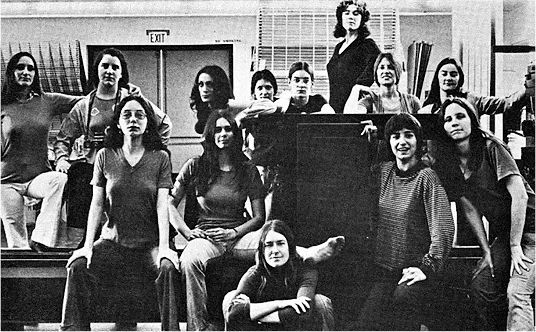
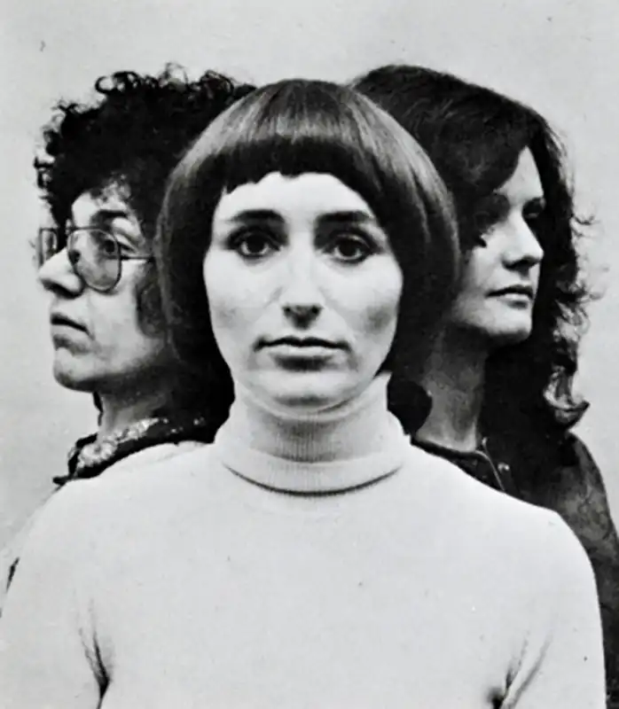
Not long after beginning to teach at CalArts, de Bretteville joined with fellow art faculty Judy Chicago and Arlene Raven to form a new offshoot, independent program they named the Feminist Studio Workshop. The initial brochure usefully repeats a picture of the three founding women together, each taking turns facing the camera. Here is the one with Sheila facing forward [↓].
The Feminist Studio Workshop met first in de Bretteville’s home, and soon was housed in the the Woman's Building, a collective site west of downtown Los Angeles. Here is a “video letter” from a participant who describes the setup. Again, the way the work gets done is what matters.
Continues in class . . .
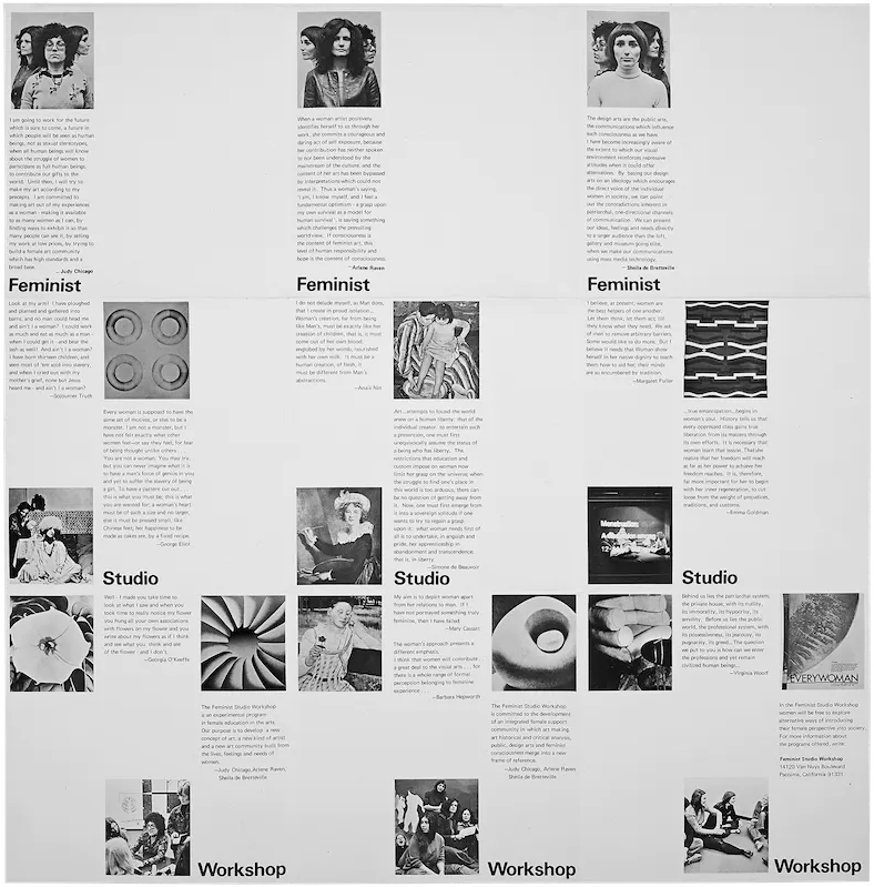
I have begun to try to find an answer for myself as a woman designer. Designers must work in two ways. We must create visual and physical designs which project social forms but simultaneously we must create the social forms which will demand new visual and physical manifestations.A printed version of her talk soon appeared under the title A Reexamination of Some Aspects of the Design Arts from the Perspective of a Woman Designer, published together with her students’ [↓] work in British design journal Icographic 6.
These were students in The Women’s Design Program at the California Institute of the Arts, a newly established program in a newly established art school which de Bretteville was instrumental in founding. The Women’s Design Program was meant to foster collective investigation between students and faculty. It was non-hierarchical, exploratory, participatory — a clearly distinct approach from the top-down knowledge transfer of more conventional teaching. And one that is neatly inline with de Bretteville’s call above. The two-sided model she suggests is powerful, recognizing that *how* design work gets done can carry as much meaning as *what* results.
On returning from Italy in 1969 after working with Olivetti, de Bretteville moved to Los Angeles to be involved in the formation of the new school. She was hired to design the printed materials to attract a new kind of student. She also edited an issue of Arts in Society. The issue has a wonderfully predictive subtitle, setting the stage for what’s to come. Again, the community, the setup, is as important as whatever teaching might happen there.
Not long after beginning to teach at CalArts, de Bretteville joined with fellow art faculty Judy Chicago and Arlene Raven to form a new offshoot, independent program they named the Feminist Studio Workshop. The initial brochure usefully repeats a picture of the three founding women together, each taking turns facing the camera. Here is the one with Sheila facing forward [↓].
The Feminist Studio Workshop met first in de Bretteville’s home, and soon was housed in the the Woman's Building, a collective site west of downtown Los Angeles. Here is a “video letter” from a participant who describes the setup. Again, the way the work gets done is what matters.
Continues in class . . .
December 1, 2025
Adam, Why Arial?
Readings
Adam-Why-Arial.pdf (David Reinfurt)
Resources
What is American about Black Dada
The Studio of Adam Pendleton
Who is Queen?
Adam-why-arial.txt
Adam, Why Arial?
Readings
Adam-Why-Arial.pdf (David Reinfurt)
Resources
What is American about Black Dada
The Studio of Adam Pendleton
Who is Queen?
Adam-why-arial.txt
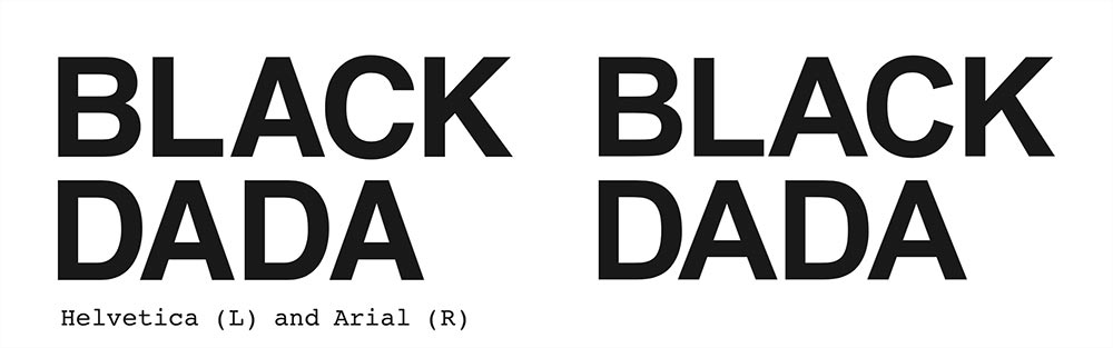
Adam,* why do you choose Arial for the letters that sit across the surface of your paintings and objects? Why not Helvetica, the industrial sans serif typeface with letterforms that are both more formally resolved and in tune with the art histories to which your work connects?
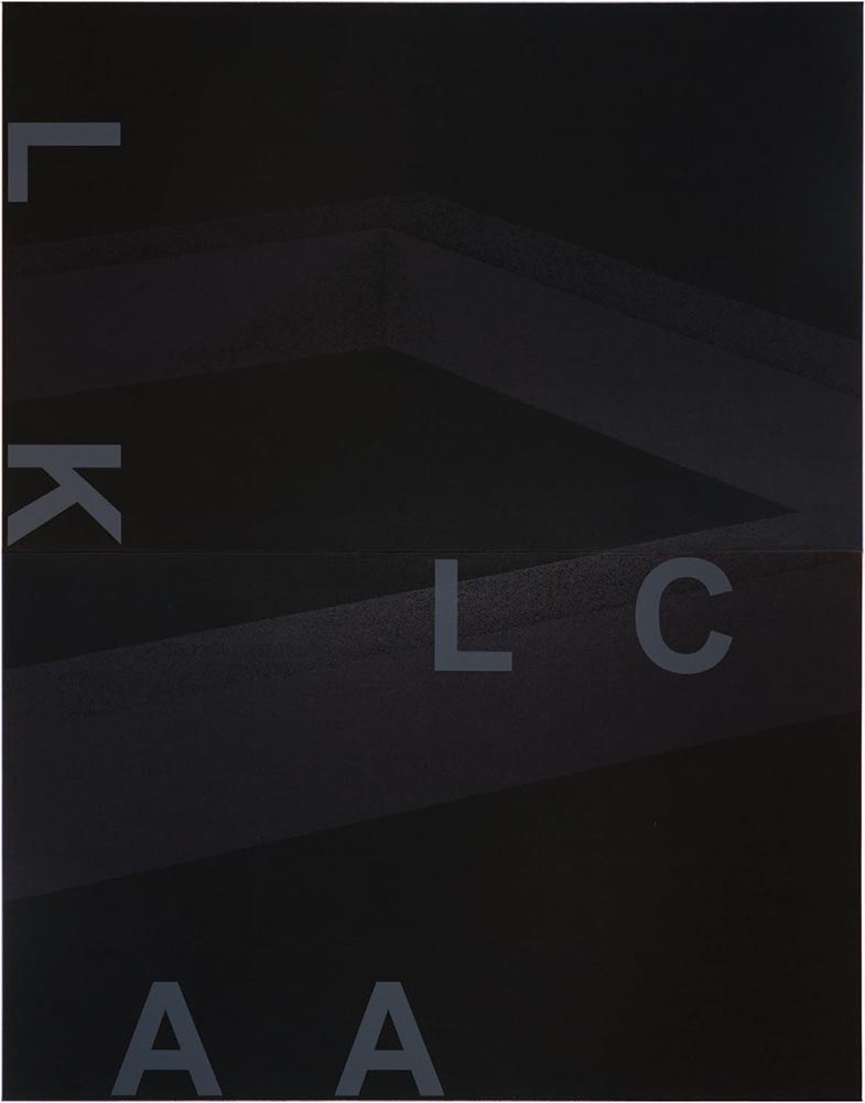
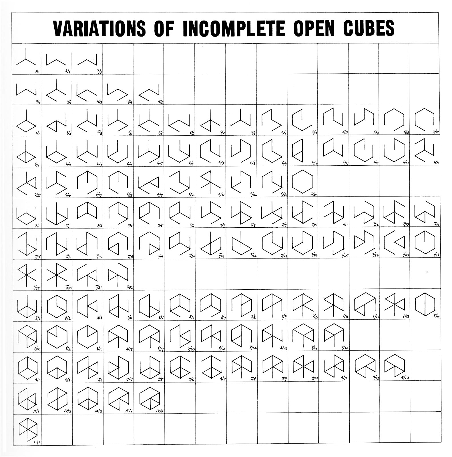
In the series “Black Dada” (2008–09), you use photocopied enlargements of Sol LeWitt’s Incomplete Cubes (1974) layered with large capital letters to spell part of your work’s title. These paintings (well, silkscreens on canvas) attempt to connect to more than one era—the 1910s of the Dada movement, through your use of its broken language strategies and your title, and also the 1970s of the unfinished Conceptual art project, through images of the Incomplete Cubes.
In “System of Display” (2008–09), a series of wall-mounted mirrored black boxes, you layer found images, photocopied and enlarged, with text fragments screened on the glass surfaces. This comprehensive series is mounted as a relentless row of ten or more boxes on the gallery wall, each containing a different found image and text fragment. Clues to the meaning of the series are located in the individual works’ titles. For example, EE (Generates / Giulio Paolini, Young man looking at Lorenzo Lotto, 1967) (2008–2009) reaches to both the late 1960s of Italian Arte Povera conceptualist Giulio Paolini and the late fifteenth-century Renaissance-to-Mannerist painter Lorenzo Lotto.
Poet Jena Osman recently described your layered text-image compositions as copies that “lovingly degrade the past in order to create a new lineage that can move into the future.” In an interview with curator Krist Gruijthuijsen you said, “My work cancels out any kind of autonomy . . . it much more concerns the connections between things that are often made disparate or have been disconnected.” It seems pretty clear that you’re trying to recompile history by creating a set of signs whose place in time is complicated. So, Adam, why Arial?
. . .
Helvetica itself was nothing new anyway—it was a redrawing of Neue Haas Grotesque in the 1950s, which itself was based on Akzidenz Grotesque from the early twentieth century, in turn derived from the Standard Grotesque of the late 1800s. Arial could easily fit into this lineage. As described in the Readme file that ships with v3.0 of the font software, “Arial contains more humanist characteristics than many of its predecessors and as such [sic] more in tune with the mood of the last decades of the twentieth century.”
* ”Adam” is contemporary artist Adam Pendleton, whose work uses typography and recycled writing extensively.Continues in class . . .
Here’s a diagram from William James’ 1890 book, The Principles of Psychology:
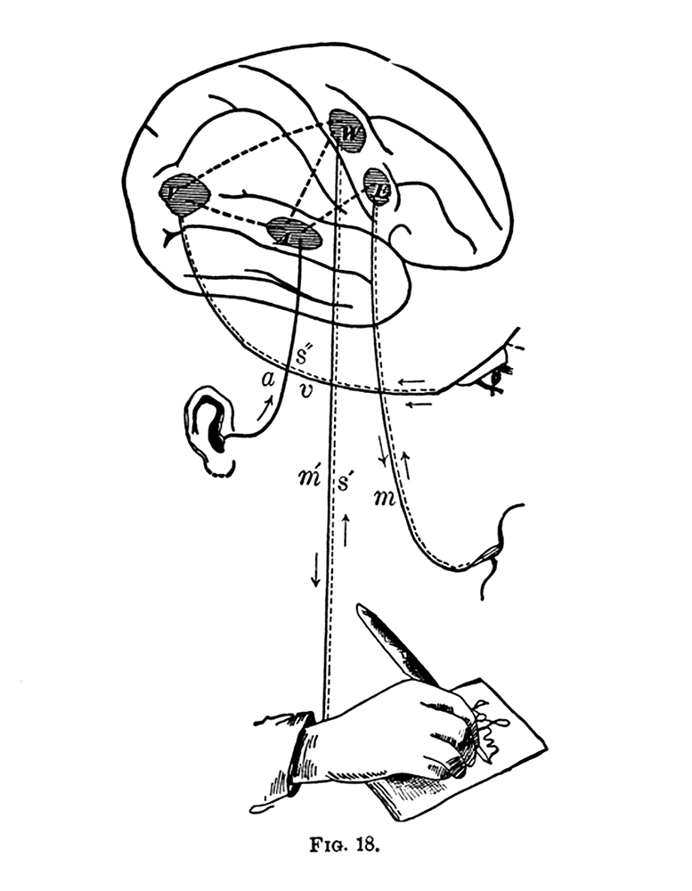
The drawing makes concrete what has been implied all semester: reading and writing are intimately connected through the *specific* shapes of the letters. Your brain decodes the shapes and corresponds the marks across a learned dictionary look-up table to produce words which produce sentences which convey and record ideas.
Your final portfolio is due today, delivered in person in 185 Nassau Street, Room 205 at 9 am sharp.
Your portfolio should be printed single-side 8.5 x 11 inches and include:
→ Story of Your Life (Ted Chiang)
→ The New Typography (Lazlo Moholy-Nagy)
→ The New Graphic Landscapes (Muriel Cooper)
→ A Reexamination of Some Aspects of the Design Arts from the Perspective of a Woman Designer (Sheila Levrant de Bretteville)
→ A Reexamination of A Reexamination of Some Aspects of the Design Arts from the Perspective of a Woman Designer (Sheila Levrant de Bretteville)
→ Adam, Why Arial? (Adam Pendleton)Plus
→ 100-word text typeset as your booklet cover, T-y-p-o-g-r-a-p-h-y is ...We will work from 9 am until 12 pm to impose and bind your booklets. See you then!